Friday, 30 March 2012


Tuesday, 20 March 2012
4) How did you use new media technologies in the construction and research, planning and evaluation stages?
TRAILER - Please click play on the youtube video to see my tagged trailer.

POSTER - Please click on image to take you to Flickr website.

MAGAZINE FRONT COVER - Please click on the image to take you to the Flickr Website
Below can be seen a shot of the software and hardware that I used in the research and planning, construction and evaluation stages :

Final Cut Pro:
- This was a new software to everyone at the beginning of the year as we downloaded the new software from Final Cut Express. It took some time getting used to, but by the end of the construction I could appreciate how much quicker and more sufficient the new software is.
- Everything in the editing and evaluation stages went through Final Cut Pro at some point; whether it was the editing of my main trailer, the editing of my storyboard graphic, the creation of idents and graphics and finally the place where I could edit interviews and vox pops made for my evaluation stage.
- The first stumbling block I had to overcome on Final Cut Pro was to accustom myself to the new tool bar so I could edit and put effects onto my original shots. This included being able to match the colours and lighting in one shot to another which meant that in my trailer I did not have any scenes that stood out without me wanting them to. This enabled me to establish a mood to my film with the low-budget British grittiness coming through with dark scenes and low-lighting.
- In the evaluation stages, I used Final Cut Pro to make a Director's Commentary and overlay that over images of my Magazine Front Cover, Poster and shots from my trailer itself. Final Cut was able to record my voice-over directly into the project which meant there were no issues in trying to align the images and speech.
- My development in Final Cut Pro has been drastic, from having no experience of the software at all, to being able to manipulate images, shots, videos, graphics and more, to how I want them, has enabled me to complete my products on time and without too much hassle.
Blogger:
- My skills on Blogger first developed in AS level whereby I had to create a blog to show off the research and planning and the evaluation of a 2 minute opening to a film. For the blog to look relevant, I changed the background of my blog to suit the theme of the main product. For instance at A2, I have made a trailer for a British Drama and therefore my background is an iconic image of the London phone box which everyone can relate to and associate with that location.
- A difficulty that I had to overcome on Blogger has been the ability to fit images and texts to size so that they do not look bigger or smaller than any other texts on my blog - so there is consistency and it looks smart.
- Embedding powerpoints off slideshare, downloading fonts of DAFONT to have in my texts, embedding videos off youtube,uploading footage from Imovie and giving hyperlinks to websites such as flickr are just a number of things which my development of Blogger has enabled me to do at A2.
Thursday, 15 March 2012
3) How effective is the combination of your main product and ancillary tasks?
I made a director's commentary using Final Cut Pro X to compare my main task of a drama film trailer with the ancillary tasks - a film poster and film magazine cover.
Please click on the play button to watch my director's commentary
Saturday, 3 March 2012
2. What have you learnt from your audience feedback?

 I carried out a screen testing where I invited a range of different ages with males and females attending, with the majority of people being in my target audience.
Audience Feedback Questionnaire

Focus Group
I was then able to put the answers into graphs:

I asked almost an equal number of males and females to attend my screening so that I could have a wide range of opinions on my trailer and confirm my view that my film will primarily have a target audience of women.

My target audience will consist of 15-24 year olds, so therefore I asked the core of my focus group to be from this age group. However, so that I could have a wide range of opinions I invited a few people from an older generation to work out whether I had a secret niche audience that I had not considered previously.


I posed the question to my focus group on what their preferred genre of film was, the answers were key to confirming my target audience. The women in my test screening preferred Romantic and Drama Films whereas the males preferred Thrillers and Fantasy films.

I asked the focus group to give their opinion on what they thought the strengths of my trailer were...in Drama films, things such as the soundtrack and acting are vital in exemplifying the genre. Therefore, it was very nice to see that people had enjoyed the soundtrack and the acting in my piece.

However, I didn't just want to know about the strengths of my trailer, I wanted to know what I could have improved and what the weaknesses of my trailer were. The feedback showed me that perhaps occasionally the sound was not clear; my shots were grainy; the graphics were too simple; too much narrative was given away that they know what happens in the film. This feedback therefore meant I could focus on the things that the audience did like, such as the shots and the wide range of locations. I also asked my focus group if they would go see my film at the cinema and 100% replied yes, so my trailer fulfilled its purpose of convincing people to go see the future film at the cinema.

From this graph I was able to establish that people had understood my narrative and the genre that which my trailer falls in to. It is vital that people understand what genre is trying to be expressed otherwise people will lose interest if they are left confused.

With my film being a low-budget British drama, I wanted to work out whether the focus group that I had invited to my screening were interested in this type of film. The majority of people answered that they preferred British film to American film because they feel they can relate to the issues and they feel a sense of patriotism as they pay to watch the film, supporting the British Film Industry.
Facebook Feedback:
Below are two screen shots of my facebook review page that I set up where anyone, mostly friends could give their opinions on the strengths or weaknesses of my trailer. There were a number of conflicting views; none more so than the opinion on the jogging scenes in my trailer. Some had the view that there were too many, some liked the first running scene but felt the others were not needed and some loved their presence in my trailer. The most useful feedback that I took into consideration was the understanding of the narrative and the understanding of the genre. With a genre film it is vital that the narrative is easily comprehended by the audience and from the feedback on facebook I was able to see that the plot of my trailer had been understood.


From my survey I created a few wordles to show me the good and bad points of my trailer:


Focus group trailer interview:
Immediately after the screening of my trailer, I asked one of the audience if they would be interviewed so I could have a more personal description of what someone in, not necessarily a target audience, but possibly a niche audience, thought about my trailer. The male seen in the interview is a 17 year old who said that he would go see my film at the cinema if it were to come out at the cinema. For this reason I was intrigued into what type of film he enjoyed, where he went to go see these films and why he enjoyed my trailer so much. So that I could try and establish a niche audience that I had not previously considered. I was particularly interested in finding out where he finds out about up and coming films and then what cinemas he goes to watch them at. This is because when looking at niche audiences one must establish how to attract them to your product.

Positive Feedback:
This is where I asked my focus group and facebook audience to tell me what they liked about my trailer. Perhaps the recurring theme from the positive feedback for my trailer was the idea that my trailer was realistic, believable and was very British. Seeing as I set out to make a trailer where my audience could relate to the main characters and their problems, it is great to see that my focus group/target audience have understood the unique selling point of my trailer.

One word description:
At the end of my focus group questionnaire, I asked them to describe my film in one word, and here are some of the things that they said. All are positive, which is nice, but the one that I pay particular attention to is the 'thought provoking' comment because this showed me that the reality of the struggle that my main character faced meant that it affected this audience and encouraged them to think about their lives and the lives of others.

Negative Feedback/Constructive Criticism:
I also asked my target audience to have their opinion on what they felt could be changed or improved in my trailer or what they frankly just didn't like. A few things cropped up a number of times, none more so than the attention to sound, graphics and quality of picture by a number of my audience. In an ideal world, I'd be able to re-do shots that came back grainy, or record my sound again to make it clearer but this is not always possible, so I focused on getting the best out of the shots I had. For the graphics, the comment about them being "too simple" I am not affected by, because I feel that the low-budget nature of my film meant that I didn't want bright colours and interesting graphics. This technique is used in a number of low-budget British films where a white text on a black background splits up the confusion of scenes and montages and helps the audience understand the narrative easily.
Focus group trailer interview:
Immediately after the screening of my trailer, I asked one of the audience if they would be interviewed so I could have a more personal description of what someone in, not necessarily a target audience, but possibly a niche audience, thought about my trailer. The male seen in the interview is a 17 year old who said that he would go see my film at the cinema if it were to come out at the cinema. For this reason I was intrigued into what type of film he enjoyed, where he went to go see these films and why he enjoyed my trailer so much. So that I could try and establish a niche audience that I had not previously considered. I was particularly interested in finding out where he finds out about up and coming films and then what cinemas he goes to watch them at. This is because when looking at niche audiences one must establish how to attract them to your product.
Poster and Magazine Feedback:
With my target audience probably being females aged 15-24, due to the romantic theme in my trailer. I was intrigued as to why males in my focus group said that they would go see my film at the cinema. So in trying to find more out about this niche audience I interviewed a couple of them and asked for their opinions on my other two products in the form of a poster and a magazine front cover. The feedback was primarily good and showed me that the boys tended to be interested in posters that caught their eye, and particularly with my poster, they enjoyed the dramatic background with strong bold images and with my magazine front cover they liked the professional, classy aesthetic that it beholds. Therefore, when taking into account this niche audience perhaps I would have to make two posters; one directed at my niche male market with the gritty, urban nature of the film being portrayed, and a second which is slightly more colourful and focuses on the romantic side to my film.
Friday, 2 March 2012
1) In what ways does your media product use, develop or challenge the forms and conventions of real media products?

Setting/Location:
At the beginning of most trailers there is a shot which catches the audience’s attention so that they don’t just change the channel or focus on something else. In low-budget films or dramas this is usually done by use of location. For instance in my trailer the second shot is of my main character outside the main gates of Wandsworth Prison. This shot, aided by the dialogue used, helps establish the genre of the film and also part of the narrative. In blockbusters such as ‘The Dark Knight’ they come with a brand name and therefore do not have to do too much at the beginning of the trailer to impress, they just have to show Batman or the Joker for example, then later in the trailer they can show off ‘the money shot’ which in this case was a truck flipping up and over onto it’s back. However, when it comes to dramas, it’s usually down to location or props to catch audience’s attention, often this will include a wide camera shot of a city like London or New York. In my case, the film is set in urban London with a gritty tone of a man’s struggle with himself to try and prove to his family he is worthy of being a father. The shot seen above with the backdrop, grey skies and darkened lighting effects will hopefully depict the struggle that many people face in Britain today, where a lack of opportunities, lack of work and lack of money mean that people from poorer backgrounds are forced to try and earn a living from illegal habits. The vital convention of a Drama Film is the use of realistic characters dealing with emotional themes that people are able to relate to and empathise with. This particular convention is one that I have conformed to, with the similarities of events in my film to those of young people in Britain today.
A recurring location in my trailer is that of my main character running on a common with heavy breathing. I used the space beside him running for where I would place my graphics, which help to portray the narrative. The inspiration for these scenes arose from my planning when I found the trailer to another British drama called ‘Shame’ where the main character is running in the night on a city street. I found these scenes very dramatic and I believe they exemplified the narrative of a man’s struggle against sex addiction and his determination to put things straight.
The final act of my trailer is a fast paced montage of shots and one scene which conforms to conventions of drama trailers is where my main character and the girl he is trying to impress are coming out of a local pub. A convention in a number of drama trailers is where there are scenes of despair but also scenes of hope. This scene conveys that feeling of hope as the question is asked to the audience about whether the main character has succeeded in earning back his family, and the only way they’re going to find out is by going to see the film.
Style and tone:
There are a number of sub-genres to Drama films such as Romantic Dramas, Period Dramas, Crime Dramas or Melodramas. But there are recurring themes across all of these sub-genres such as drug addiction, alcoholism, poverty, class divisions and so on. With these themes there is often a dark and sinister tone to Drama Films which portrays a very sad side to life. In the peak of a recession and where jobs aren’t easy to find, I wanted to do a take on a very realistic life of a Londoner whom has just come out of prison and doesn’t seem to have many opportunities at his feet to be able to start afresh. The scene above shows off this dark tone with use of drugs and alcohol and the obvious plan to sell these substances on to others. With low lighting and use of props I am left with a scene that shows off how young people are sometimes forced to make a living. Another scene which indicates the despair that my main character faces is when he is seen holding a young man up against a wall in a menacing manor and is robbing him of his possessions. The inspiration for the tone of these few scenes came from the trailers for the film ‘Kidulthood’ and its sequel ‘Adulthood’. Heavy violence, strong use of drugs and alcohol exemplifies the dramatic style that I want in my trailer.
However, my trailer is not all doom and gloom as I wanted to challenge forms of Drama films where they give an upsetting and hard-hitting view on the life of young people; I wanted to put a Romantic twist on a film which shows very little sign of hope. The scene of hope in my trailer is with my main two characters smiling, and looking like they’re enjoying each other’s company outside a local pub. My early planning was looking at films such as ‘The Notebook’ and ‘Dear John’ to see how they portray a romantic style but also with dramatic scenes. This is where my trailer challenges other Drama Films with its strong urban feel with the locations, violence, drugs and costume but also creates scenes of hope with the romance between my two main characters.
Costume and Props:
The costume which is seen most in my trailer is probably the hoodie or tracksuit. Nowadays there is the image of a young man or boy on a street normally wearing a hoodie which is often considered to look menacing because it conceals the face and the face is where one can see the emotions of others and if this is partly covered then people will feel threatened. A hoodie is also often linked to lack of wealth and those living on estates or on the streets. There are a number of British Urban Dramas where the hoodie can be seen as a symbol of the street and a symbol of threat; such as ‘Anuvahood’, ‘Football Factory’ and ‘4-3-2-1’. The colours of the hoodies and clothing in my trailer is no coincidence, as the main character is often seen in a lighter colour to his friend who is supposed to be leading him back to his old habits such as drug dealing and violence. As seen above, my main character is in white and his friend is in a dark grey. This theme is also supported in the scenes with my main character and the main female in my trailer, as he is wearing darker clothes to the female to symbolise their gap in morality and behaviour.
There is one particular scene where an audience can see props and this is where my two male characters are seated on a sofa, sorting out drugs readying them for sale. The props on the table are there to help establish the genre and narrative. When I decided to go for a gritty, urban British drama I looked at other film trailers similar to the style I was going for and I stumbled upon the trailer for ‘Shifty’ where drugs being used as props help to give the audience a feel of the style and tone of the film.
Camerawork and editing:
When out on set is was vital to take a number of shots so that when it came to editing I was able to choose from a wide number of shots and angles to finally have best possible shot for that scene. In the scene above I deliberated over whether to use this close up shot of my main character or whether to just stick with the conventional over the shoulder shot. I choose to keep this image because I believe it is intimate, intimidating and involves the audience to the point where they feel they have been addressed. The close proximity to the camera means that his facial expressions are heightened and I believe the aggression in his face will come across to the audience to heighten the drama in my piece.
Another key shot that I contemplated over which angle to use was the scene at the prison, where I wanted it to be the shot to stun the audience with the backdrop. Therefore having the whole prison’s front gate with a wide shot was more important than having my character come out of the visitors exit which would have looked rather bland and not obviously a prison.
The scene with my main character running enabled me to be creative and trial with a number of different camera techniques. For example, the opening shot to my trailer is a hand held shot of my main character with me running alongside him with the camera. The other two running shots are of the character running close up towards the camera and this was a good time to place my graphics depicting the narrative and the awards which my film has won, such as seen in the trailer for ‘Shame’.
After all my shots had been shot, I had to try and edit them into a trailer, particularly focussing on pace and the aesthetics of my piece. In most trailers there is a build-up in pace through a trailer, I decided to conform to these conventions of a trailer and started my piece by over cranking a running scene so that it is obviously slow-mo. Act 1 then returns to normal pace with shots explaining the narrative and this continues through the whole of Act 2. However, in Act 3 this is when the pace of the trailer begins to build. I decided to use a montage of shots with transitions in between the scenes showing the drama of my main character’s life. Finally, in the editing stage I wanted to focus on the aesthetics of my trailer, so I matched the colours from each scene so that the dark tone of my film could come across and so that there were no scenes which stood out because they were brighter when I hadn’t planned for them to be. In other urban trailers such as ‘Attack the Block’ and ‘Shifty’ the use of effects on scenes to make them look darker is regularly used and that is something I wanted to use to help establish the style and tone of my trailer.
Genre:
In the early planning for my film I looked at the conventions for a Romantic Drama, which focuses more on love, passion and emotion. I came to the conclusion that this was not something that I was going for with my film so I settled on the genre of Drama with scenes of Romance. ‘Dramas are serious, plot-driven presentations, portraying realistic characters, settings, life situations, and stories involving intense character development and interaction.’ This quote showed to me that this was more the genre that my film fell in to, especially as I paid particular to my film being realistic and audiences being able to relate to it. Things that someone is likely to see in a Drama Film include; alcohol, drugs, sex, moral dilemmas, poverty and class divisions. You will find some of these in my trailer with the scene of my main character and his best mate seated at a sofa getting involved in the drugs trade and also the scene where the main character is holding an innocent man up against a wall, this is a sign of the violence to come in the film. Violence in films induces fear and stress for the audience and these are the types of emotions I want them to feel during my film. However, my film is not entirely about violence and drugs, that is where my early idea of doing a Romantic Drama influenced my final product. I made sure that the trailer is not about the despair of this man’s life and his struggles as he tries to make a start in adulthood. For this reason, I included scenes of hope with my female character to heighten the dramatic struggle for this man which will subsequently end with him changing his ways and trying to become a father. The two scenes in my trailer which most conform to the Drama Film genre are the running scene as the accompanying heavy breathing enlightens the audience to this man’s determination to change his ways, and the other scene is of the female character seated on the stairs as she expresses her emotions with tears.
 Poster:

To establish whether I believe I conform to modern day film poster conventions, I must first establish what the conventions of a film poster are. In my opinion, a film poster for my genre would include a number of things such as; a billing block, a main image, the title of the film, actor’s names, possibly director’s names, secondary images and a tagline. But how many of things from this list did I decide to include in my poster? The answer is all of them. Having looked at posters for low-budget British dramas I came to the conclusion that there was a recurring theme throughout all of them, and this was the use introduction to characters through a main image where the actors stare directly at the camera and address the audience. My main image consists of my main character looking fairly menacing and looking directly straight towards the camera. I believe his facial expressions and the intimacy of the size of his face in comparison to the size of the paper, adds a dramatic feel.
I considered just using this solitary image and altering with the lighting and background to make the poster very personal, just as seen in the film poster for ‘Bullet Boy’. However, I concluded that in most urban British dramas their film posters do not just have one solitary image of one lonesome character. In film posters such as ‘This is England’, ‘Kidulthood’, ‘Adulthood’ and ‘Shanked’ a group of characters from the film are lined up in a straight line addressing the audience. Perhaps where I decided not to conform to these conventions is where I came to the conclusion that I wanted my three main characters to have the own little section of the poster, separated by the film title, like seen in the film poster for ‘Atonement’.
Something which most stood out for me on posters for Drama Films is the use of a backdrop, whether it be a city or just a wall, in many of them there would be a dramatic grey sky, this is evident in the film poster for ‘Brighton Rock’. This is something that I took note of and decided to include in my poster with strong dark clouds of the two male characters and slightly lighter ones over the morally better, female character. The inspiration for my title and the graphic surrounding it came from posters like ‘Shifty’ where the ‘I’ in the film title is stretched down to split the two characters and this is something I used so that my characters were easily distinguishable.
Things such as the billing block, actor’s names and social networking sites on a poster are obligatory nowadays, and I believe, in particular having a Facebook group on the poster is vitally important because it means friends and family are able to review my poster and give feedback.


Magazine:
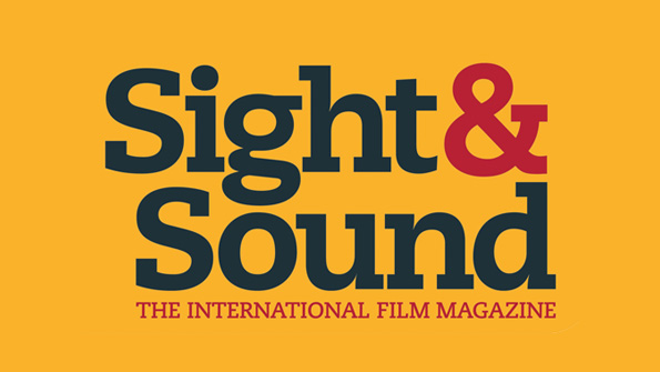
When it came to my magazine front cover I conformed to a number of conventions of previous covers but there were a number of things I felt I wanted to change so that my magazine would have a place in the competitive market of film magazines. With my film being entirely British funded and located in the suburbs of London I looked at previous magazines that had given new directors and producers, working on a low-budget, a feature in their magazine. The magazine which I felt I most conformed to was Sight and Sound not only because of the type of film they would feature but also the look of the front cover itself. Sight and Sound is an art-house International Film Magazine that looks at films from blockbusters right down to low-budget Indie productions. For my title I focussed in on something which I believe there is a gap on the magazine market for and that is the idea of a magazine that is independent to British films but not only that, a British magazine that focusses on young talent up and coming into the film industry from the streets of Britain.
A convention of all magazines is the use of a main image, on my poster i've made that person in the main image, me, the producer and director of my film. This technique is used more in art-house magazines such as Sight and Sound and occasionally Total Film, it is used less often in Empire where they are more inclined to use well-known actors or characters. With all magazine front covers there is a USP, which tends to be this main image, and that is something which I have conformed to as the USP of my magazine is my main image. I wanted to focus on my magazine giving a break into the film industry to lesser known directors and producers from British descents. Next, I had to look at the placing on the page of my main image, my masthead and the text. A convention of a film magazine front cover is that the text and masthead are on the left third of the page because when they are lined up on the shelves this will be the bit poking out. Therefore, I conformed to these conventions and placed my text and masthead on the left third of the page.
Following this, I looked into the conventions of mastheads of previous magazine front covers. For 'Empire' they have the title large and bold yet occasionally behind the main image because all the audience needs to see is the 'E' or the 'IRE' and they will realise what magazine it is. This is similar for that of the Total Film magazine masthead. However, I was more intrigued by the masthead for Sight and Sound where they used a black text on a bright yellow background to catch the audience's eye when sitting on the shelf. From then on that audience will associate those colours when they see them on the shelf to that magazine. Therefore, I believe I conformed to the convention for the magazine masthead of Sight and Sound, whereby I made my masthead a strong white text on black background to draw the audience's attention immediately to my magazine when sitting on the shelf.
Finally, I looked at the text used on previous magazine front covers and took this into account for my magazine. A vital part of a magazine is the tagline; this is where they describe their magazine in one sentence to sell it to their target audience. In my case I used the tagline 'The British Film Magazine' to target my solely British audience. Another crucial part to a magazine are the coverlines, where the audience is told what is featured beyond the front cover of the magazine and on the inside pages. I conformed to the conventions of these coverlines with my main coverline describing the main image and my USP, and the smaller coverlines describing what is featured in the inside pages. The colour palette that I used for my magazine's text is very ryan and British with the colours of the Union Jack being used. Furthermore, the strong brown background has a rigid pattern to it that adds to the gritty, urban and dramatic front cover I was going for. Perhaps the biggest convention that I did not conform to was the use of 'puffs', whereby pictures of other films or features are put on the front cover to draw more appeal to what appears inside the magazine. I decided against using puffs because having looked at Empire and Total Film where they are used, I could see that they give a glossy, slightly tacky look to a magazine front cover. However, for the magazine 'Sight and Sound' which is most similar to mine, there are no 'puffs' because they want a more indie, art house and classy look that doesn't look so glitzy. Consequently, I decided against using 'puffs' because I did not want an airbrushed, Americanised look, I wanted a very British, low-key, art house product.
Wednesday, 29 February 2012
Poster Development


1) Starter Images: First of all for my poster I had to decide what my main images would be and what my U.S.P would be. I centered my poster on two images of my main male characters, seen above. The U.S.P will be the addressing of the audience with the stare by my main character which will grab the audiences attention and look rather dramatic. Then my secondary image will be the supporting actor representing a separate character and separate personality with his expression.
2) Background image: I had my main images, now I needed a background. For the background I decided to have dramatic grey clouds, representing the dark, gritty nature of my film and also the audience are then able to establish the Drama genre that is being exemplified.The image itself is an image that I took of clouds on a relatively bright day, then the effects that I applied to it on Photoshop meant that I could have a much darker and moodier background.


3) Text: A vital part of a poster is the text and the titles. I wanted the title for my poster to stand out in the street and therefore, I used bold colours such as red and black with white text. I also wanted the title to split up my poster into 4 parts so people could distinguish characters, text, reviews and taglines. The images seen above are key for the marketing campaign of my film; the star is to symbolise the rating of my film from well known sources and the social network logos such as twitter, facebook and youtube show the audience a place where they can become an active audience and discuss their opinions on the up and coming film with others.

4) The final product: I put the parts together and I was left with a poster that I was pleased with as I believe it is clear what genre of film my film is and the tagline really helps to establish what my film is about. Reviews and critics are key to people deciding on whether they are going to go see a film at the cinema and that is why I have placed them clearly in the top right hand corner of my poster. Finally, the inclusion of the film's website on the poster is another important convention of film posters which encourage the audience to look at the film in further detail and become active.
Magazine Front Cover Development

1) Main image - This was the starting image for my poster with no effects on it whatsoever. There was strong lighting in the room which meant that my face and it's features are clearly visible. It is vital to have a clear main image so that when people see it on the shelves they immediately recognise who is on the front or what is being portrayed.


2) Masthead - Next I made two photoshop documents for the masthead of my magazine front cover. Using a white text on a black background was key to making my magazine stand out on the shelves. Similar to the yellow colour background for the Sight and Sound masthead I wanted to catch the eye of the audience with my main title. The words relate very much to the theme of my magazine with it's Britishness and looking at English films started on low or high-budgets. Next to my masthead I accompanied it with a tagline to support the British theme being portrayed: "The British Film Magazine", also I got the logo for BFI and placed it on the background to give the magazine a classy feel.

3) Barcode, Dateline and Cover Price - Following this I added the dateline, cover price and barcode which can be seen above. Continuing with the black background with white writing, I also made the issue's month red because it stands out on the black background and is again a colour of the Union Jack. A small logo that I got off Google Images and darkened was the coat of arms of London, again to symbolise the urban nature of my magazine, focussing on young British talent from the streets and following their progress in the film industry as a worldwide picture.

4) Having the main image, the masthead and the barcode sections I placed these into one Photoshop document and my Film Magazine front cover began to take shape.

5) Background Image and Text - Here is where I added my main text and also the background to the whole magazine. I had in mind that the background of a wall of which I took a photo of would not be the main background as it is too bold. I would therefore, use the texture of the background and place brown shapes over it to make it look less rigid and more up-market. The text's colour palette is the colours of the Union Jack again to symbolise the Britishness and the font is downloaded off DAFONT which gives a very urban look to my magazine with sketchy serif effect.

6) Final Product - The final touches to my final product included adding three blocked brown shapes to the background and tweaking down their opacity so that the rigid, gritty background could come through with its pattern. Finally I used the gradient tool on Photoshop to blend the main image into the background so I didn't stand out and look extremely artificial compared to the background. This is what the darker brown shadow around the main image is.
Saturday, 25 February 2012
Magazine Front Cover Audience Profile
Most magazines in the UK are owned by Bauer Publishing Group. Most notably they own 'Empire' Magazine. It is most probable that Bauer would publish my magazine and sell my magazine at retail all over the country. The audience to my film magazine would not be too similar to 'Empire' magazine and would rather be more like the audience to the film magazine, 'Sight and Sound':
“Sight & Sound” is a British film magazine, published monthly by the British Film Institute. It was first published in 1932, before being taken over by the BFI in 1934. For the majority of its history, “Sight & Sound” has been published as a quarterly magazine, except for a brief spell as a monthly magazine in the 1950s and from the 1990s onwards. “Sight & Sound” is marketed as a high-brow, consumer magazine. It's audience is considered to be mainly male, around 70% to be precise but most importantly is considered to be read by academics and written by specialists within sectors of film. Whereas "Empire" would lean towards a more mainstream audience who are only interested in whether a film is "good" or "bad". They are not interested in reading in depth articles into the positive and negatives of a film. Furthermore, "Sight and Sound" reviews every film that is being released in the UK during that month, whether it is Indie or Arthouse or a big blockbuster, it doesn't matter, they will review a film no matter the money put behind it in the production stages. This is something that I would look to do with my Film Magazine, however, where "Sight and Sound" is an International Film Magazine, perhaps I would like to make a magazine that predominantly looks at home-grown talent and their work in the UK.
Friday, 24 February 2012
Magazine Drawing Draft

Above can be seen my first drawing draft for my magazine front cover, with particular attention being paid to the focus on the main image, the masthead and the cover lines. I would want my magazine front cover to be simple yet classy, like the front covers to the film magazine called 'Sight and Sound'. Therefore I did not want too many bright colours like seen on 'Empire' or 'Total Film', I want it to look low-budget and keep it very British, so I can attract my target audience
Tuesday, 7 February 2012
Adulthood and Kidulthood Posters


Shifty Film Poster

Shifty is a low-budget British urban drama which holds a number of similarities in the narrative, focussing on the life of young men and their struggles. This poster above shows a number of techniques which I may be interested in to use in my film poster. The bright yellow and the contrasted black title gives this poster a simplicity and also helps it to stand out and draw attention from walkers on the street. The main photo of the two young males seated is an image that I am hoping to use with my main character posing on the left side and right side of the poster symbolising his change from "bad" to "good" and also enlightening the audience to my narrative, especially as this image will be accompanied by the title of the film in bold saying, "Redemption". The title vividly stands out but the thing that I am most interested in is the use of the 'I' in "Shifty"dividing the two characters up, I believe I can use this with my film to symbolise the change in lifestyle for my main character and the divide between the past and the future without giving too much of the narrative away. "24 Hours To Deal Yourself Out" - This tagline seen above is very dramatic and would certainly encourage people to go see this film if they are interested in the lives of those who grow up on the streets and are less privileged and therefore must resolve to drug dealing to pay off debts or stay alive.
Friday, 20 January 2012
Poster Drawing Drafts

This was the first idea for my film poster with two close ups on my main character with two different expressions, one where he looks menacing and the other where he looks peaceful. The secondary images are there to support the main images and the different sides of this one person that they represent. The idea of the title splitting two characters was something that I liked from other film posters such as 'Shifty' as I believe it help the audience distinguish between the two and the different personalities that they represent.

An idea that I also enjoyed is visible in the poster for 'Shifty', the main image is of two males sitting against a wall of some sort. This strong urban look is something that I want to portray in my film poster and therefore, having my main image in front of an urban backdrop of some sort would really exemplify the mood and themes of my film.
Thursday, 19 January 2012
Analysis of Film Magazine front covers

The poster seen above is of an issue of Sight and Sound where instead of the main character being the U.S.P and the main image, it is the director or producer of the film. This is something that his given inspiration for my magazine front cover as I plan to have an image of me the director of my trailer on the front cover. The bland, plain background is simple yet effective as it gives a nice cool, classy look to the magazine. Again perhaps I will look into having a relatively bland background so that all the attention is put onto the unique selling point of the magazine front cover, that is to say, the director or...me. The text seen above gives a rather urban look with serif fonts being used, this is something I will aim to use on my magazine front cover as the theme of my trailer is a gritty, low-budget British one. Moreover, the colour palette again resembles that Britishness with blue, red and white being used which represents the colours of the Union Jack. Finally, the masthead with the bright yellow and with it being present on the left third of the page, is something that will make it stand out when lined out on the shelves. I will therefore try and use a technique similar to this when I create my masthead.
Subscribe to:
Comments (Atom)